Quick Quest
Let's make Healthcare easy.
Team Members
Gabby Suazo
Kate Zhao
Amy Zhuang
My Role
Researcher
UX Designer
Tools and Skills
Mobile Design
Directed Storytelling
Journey Mapping
Figma
Prototyping
Project Description
As we entered this project, we found that we were all drawn toward the topic of accessing electronic health records. We had all struggled with electronic healthcare at one point or another, and we anticipated that current systems in this area would be problematic and lacking for many other people as well.
Our main goal in this project was to minimize the complexity and confusion associated with the health record request process to create a more streamlined and personalized experience on the patient side. In turn, this would reduce the amount of time and resources UPMC’s patient services department would have to devote to customer service.
Duration
5 weeks
Research
Individually, we started off by doing some pop-up research. Each member interviewed at least 3 people and created a customer journey map for each interviewee. We used directed storytelling to conduct these interviews. At this point, we hadn’t yet narrowed down our target user because we wanted to see what part of the customer experience journey people struggled with the most first before deciding how we could effectively tailor our solution to that specific group.
Identifying Issues
We identified the two main issues as:
- Miscommunication
- Lack of Standardization
On the medical side there is lack of standardization between health care systems, which makes it difficult to manage and locate different records or documents. Additionally, it is frustrating communicating between different health care professionals and organizations when it comes to getting assistance with the record retrieval process. This leads to issues on the user side. There is a lack of clarity throughout the process, which makes it tedious and frustrating for the user.
We realized we could not transform the entire health care industry, but we needed to focus on a client to address. We chose to focus on UPMC, since most of our participants were in Pittsburgh. More specifically, the Customer Service Department, as our solution aims to decrease patient confusion and reliance on customer service and doctors.
Exploring Solutions
We were exploring ways to improve communication, keep the user informed in what step of the process they’re at, and having a more personalized experience. While brainstorming we were inspired by amazons chatbox. We wanted to create a more personal experience for users to reduce confusion for the user, and decrease the amount of support users would need. Our goal was to create a platform that had a clear flow, and would guide the user through each step, as well as help them make decisions using an AI-based platform.
Bringing Our Research Together
Through our research, we found that most of the problems for users were at the requesting phase. In the requesting phase our users were most frustrated because of the long and tedious process in comparison to other phases, which would also cause issues in other pases.
For example, identifying and locating the records in preparation for the requesting phase and assessing records after they have been requested also caused stress for our participants. Therefore, through focusing on the requesting phase we were also able to address issues that came up in other phases, as well as addressing problems that arised in the requesting phase.
Next, we wanted to indentify a specific use case to follow and address.

Albert Rubenstein, 23
Pittsburgh Local, Recent College Grad
Health Concerns:
Diabetes, Blood Sugar Levels
Situation:
Moving temporarily from Pittsburgh to Arizona, switching doctors
Goals:
To retrieve his most recent blood sugar level
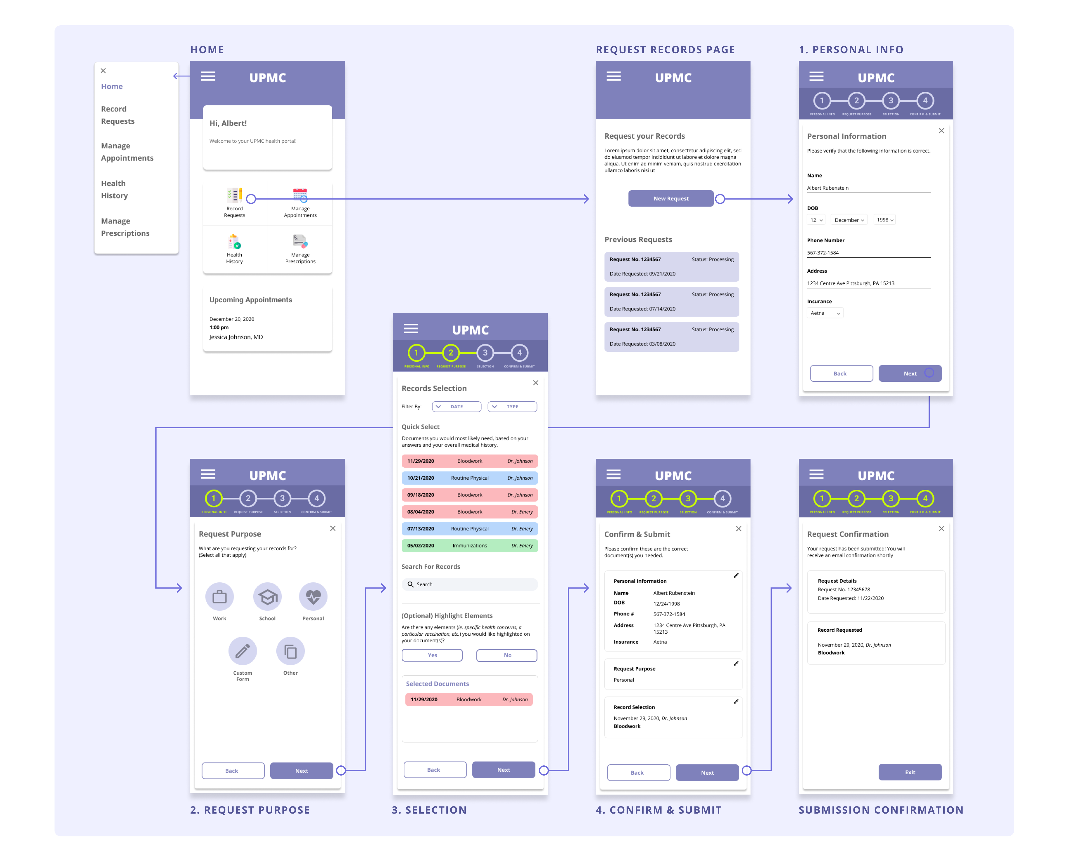
Paper Prototyping
During the think aloud testing in class our peers were able to follow the process Albert would take and begin the request process, but our peers did bring up a scenario in which the user would want to have a form filled out with information. In the prototype we provided the Request Purpose screen only had options in which the user would want to request a record that already exists.
In order to solve this we added another possible selection on the Request Purpose page. We added a custom form selection, so that the user would be able to select that if they had a form they needed filled out by the doctor.
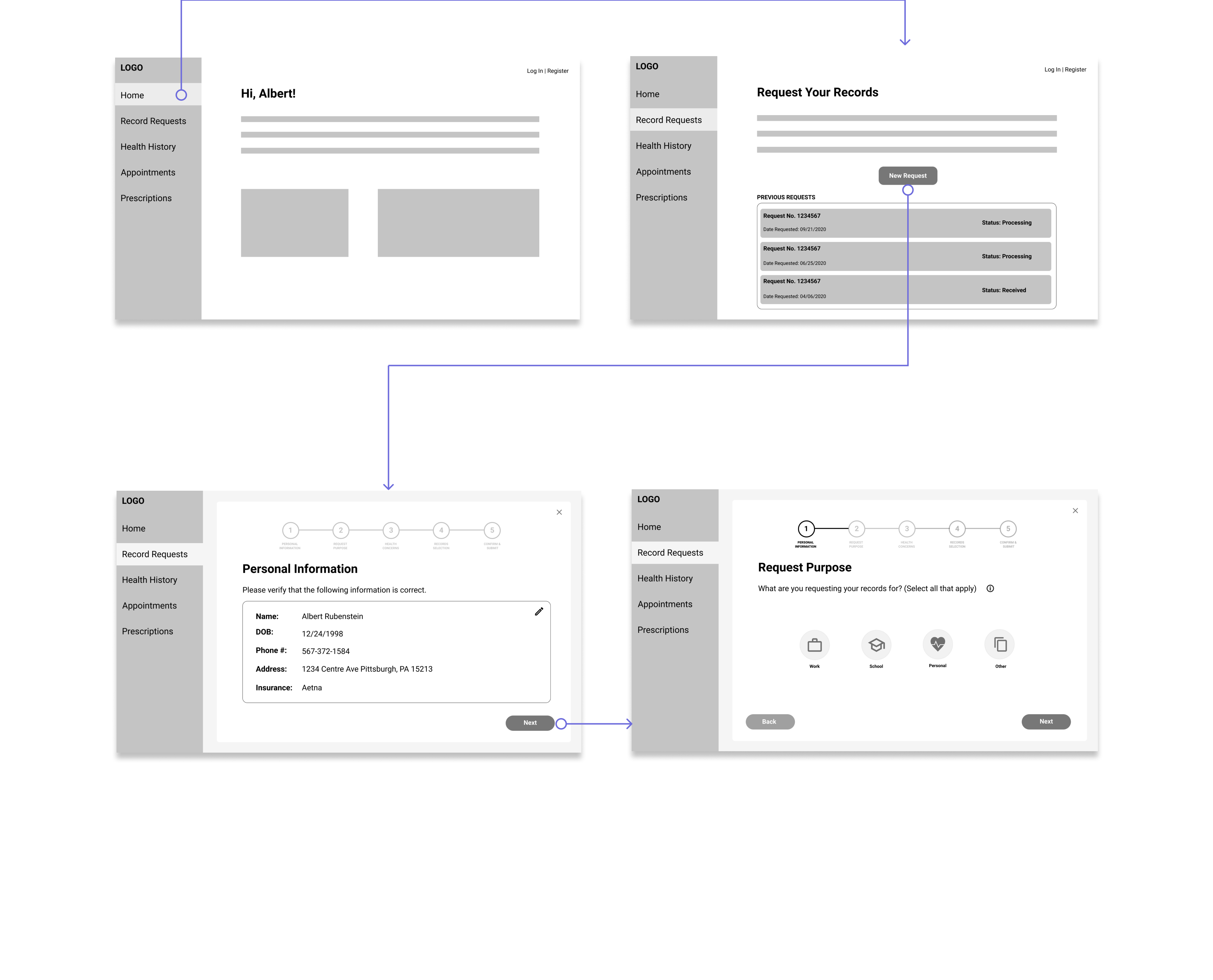
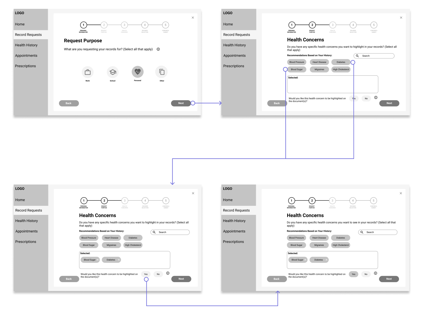
Once Albert selects the reason for his request, which is personal, the next step is identifying health concerns Albert has, and deciding if it is something that should be highlighted on the record.
Our peers were able to identify the health concerns Albert had, diabetes and blood sugar, but were unclear about what the question at the bottom meant. Additionally, not every individual would have specific health concerns, so it should be optional.
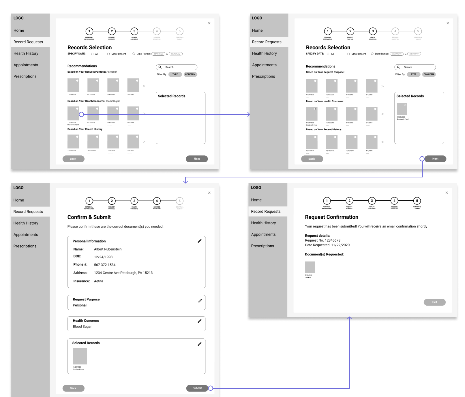
After selecting Albert’s health concerns the user is brought to the record selection page. Our interface provides multiple recommendations based on the answers provided on previous steps. We receive feedback that there was an overwhelming amount of recommendations.
Additionally, the thumbnails were taking up a lot of space, and it was not realistic to have a thumbnail of a record that you have not received yet.
Prototype Reflection
Based on fedback we received we realized a lot of the decisions we made were specific to Albert, and that we needed to think more generally regarding other use cases too. We also wanted to refine our record selection page most in the next prototype because during our think aloud testing this step caused the most confusion.
These were the two main design changes we made moving forward:
1 Selecting Thumbnails
On the
Record Selection page we went from using
thumbnails as the selectable elements that represent
a user’s documents to using labelled and color-coded
rectangles. These new selectable elements
would be easier and faster for users to asses, decide,
and select the documents that they needed.
2 Health Concerns
The Health
Concerns page seemed unnecessary and confusing. While
our team felt that it was important to include this
feature in the prototype, we decided make it an
optional element on the Record Selection page.
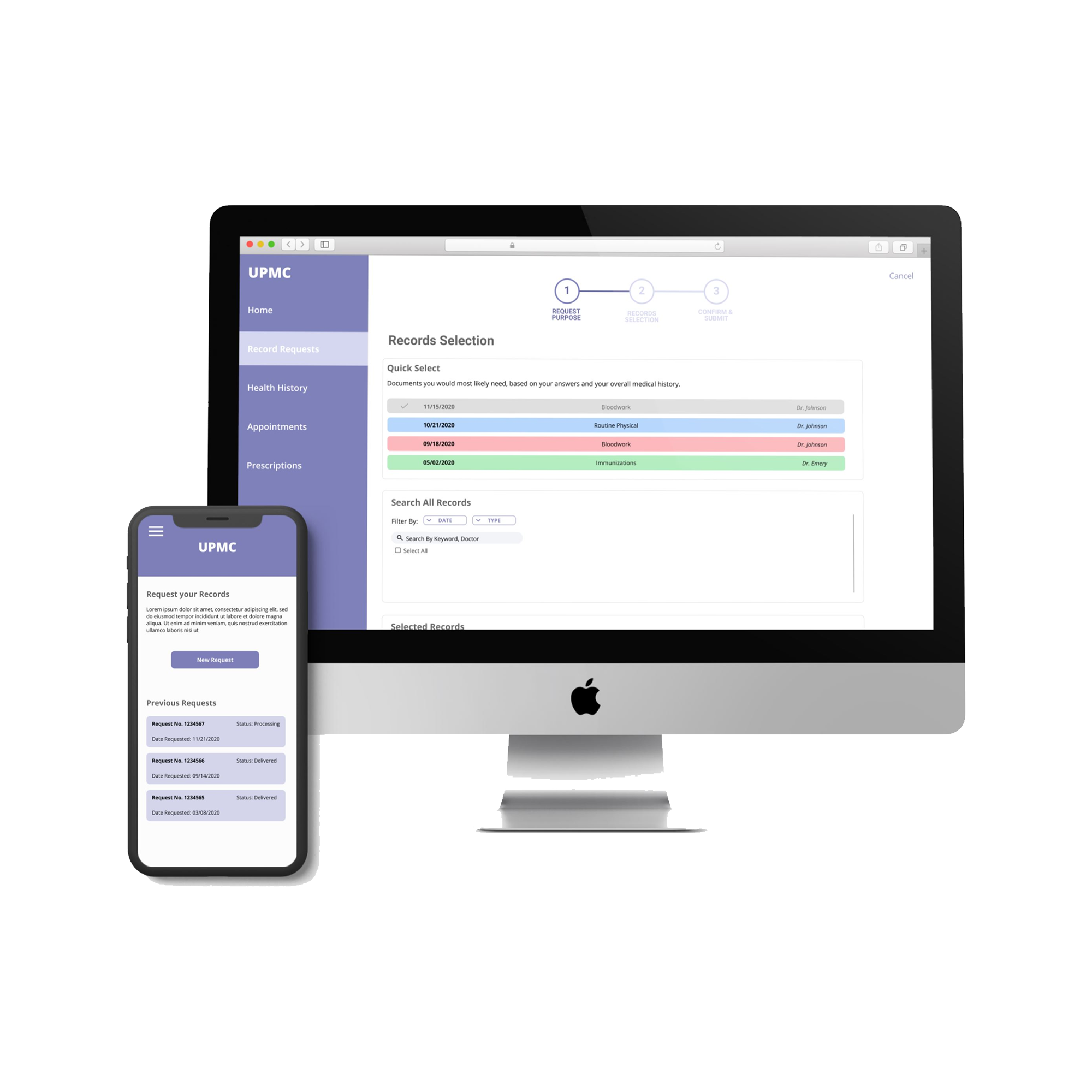
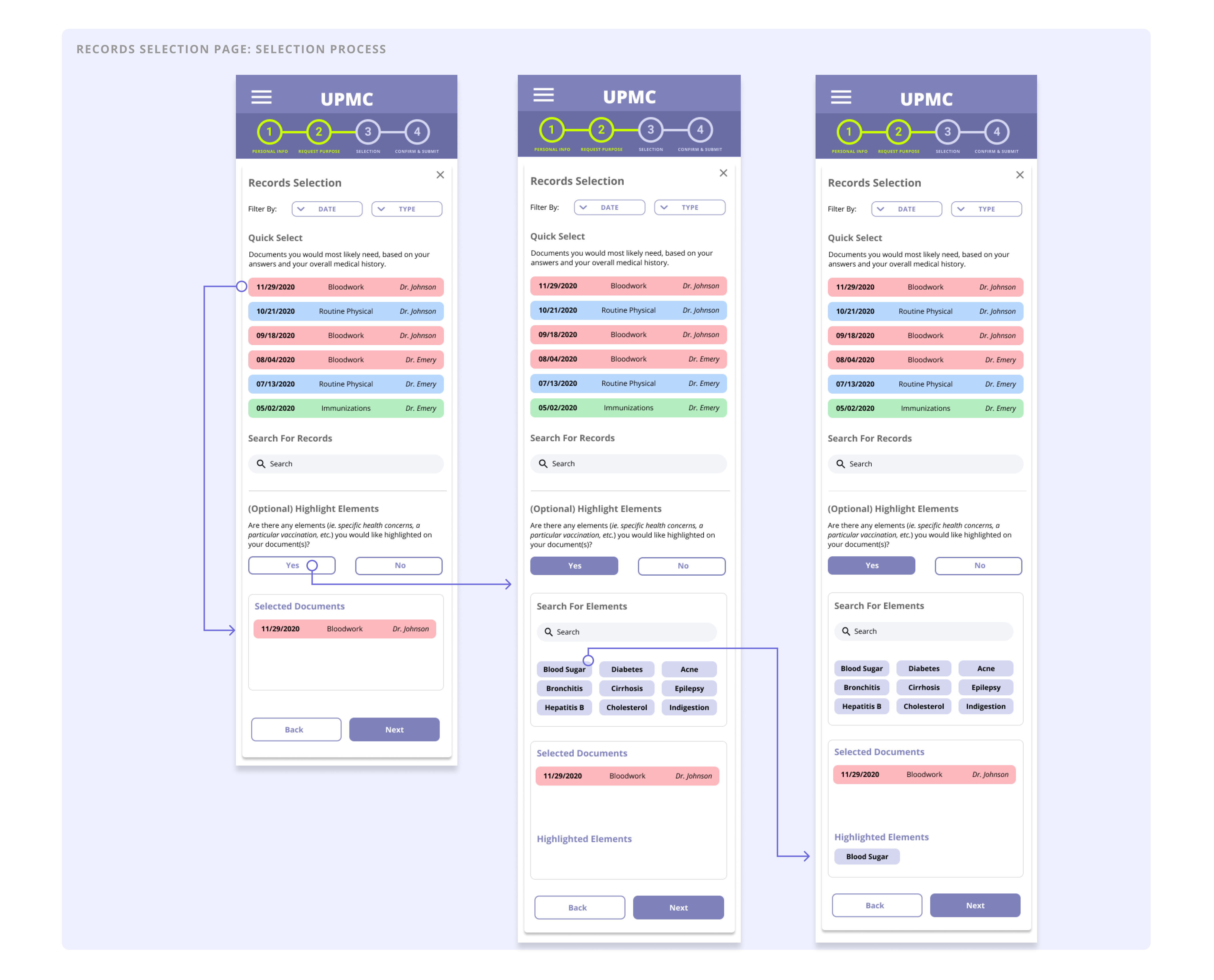
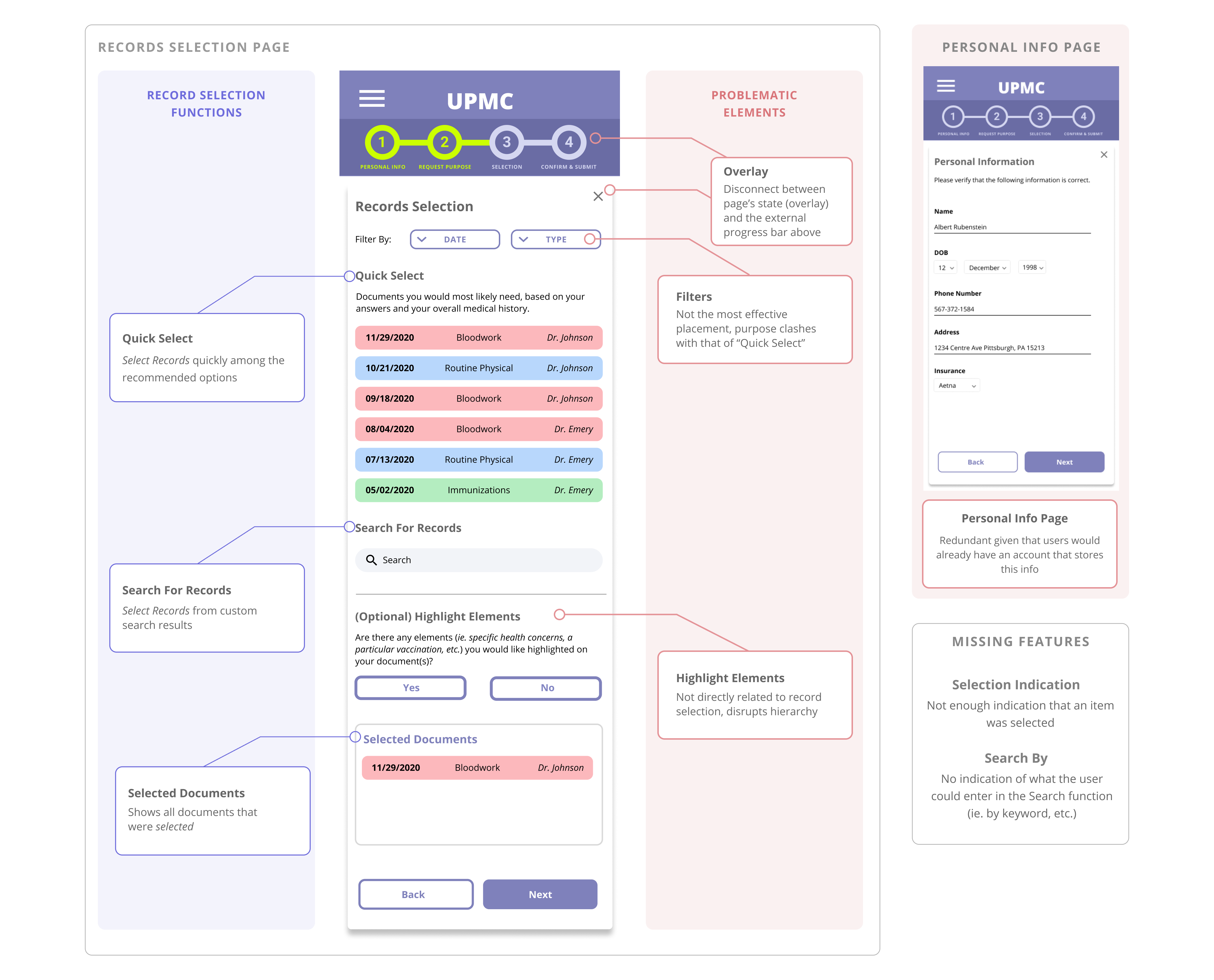
Record Selection
After designing our paper prototypes exclusively for desktop, we decided to do our next iteration for mobile in order to start defining the responsive features and polish the overall layout.
Selected documents move down the screen to the section designated to keep track of requested documents.
Additionally, the Highlight Eelements question is optional. To save screen real estate on the mobile device we have made it a drop down that takes up minimal space if the user decides not to answer the question.
Visual Design and Color
At this stage in our design process, we introduced color and icons into the design.
For example, we used an icon of a document with checkmarks with the label “Record Requests” under it so that users would be drawn to it faster than browsing the menu.
We introduced a color palette of dark purple, light purple, white, and gray in order to portray the clean and minimalist feel of a hospital’s platform, while using color psychology with purple to represent the brand’s wisdom and reliability.
Analysis and Critique
Through the feedback we received on our med-fi prototype, we found that there were several main issues in regards to visual hierarchy, structure, and how specific elements fit into the overall context and purpose of our design.
- The out-of-place “Highlight Elements” disrupted the overall visual hierarchy and flow of the page
- Redundancy of the Personal Info page
- Not enough visual feedback when an item is selected
- Search function is too ambiguous
Overview of Changes
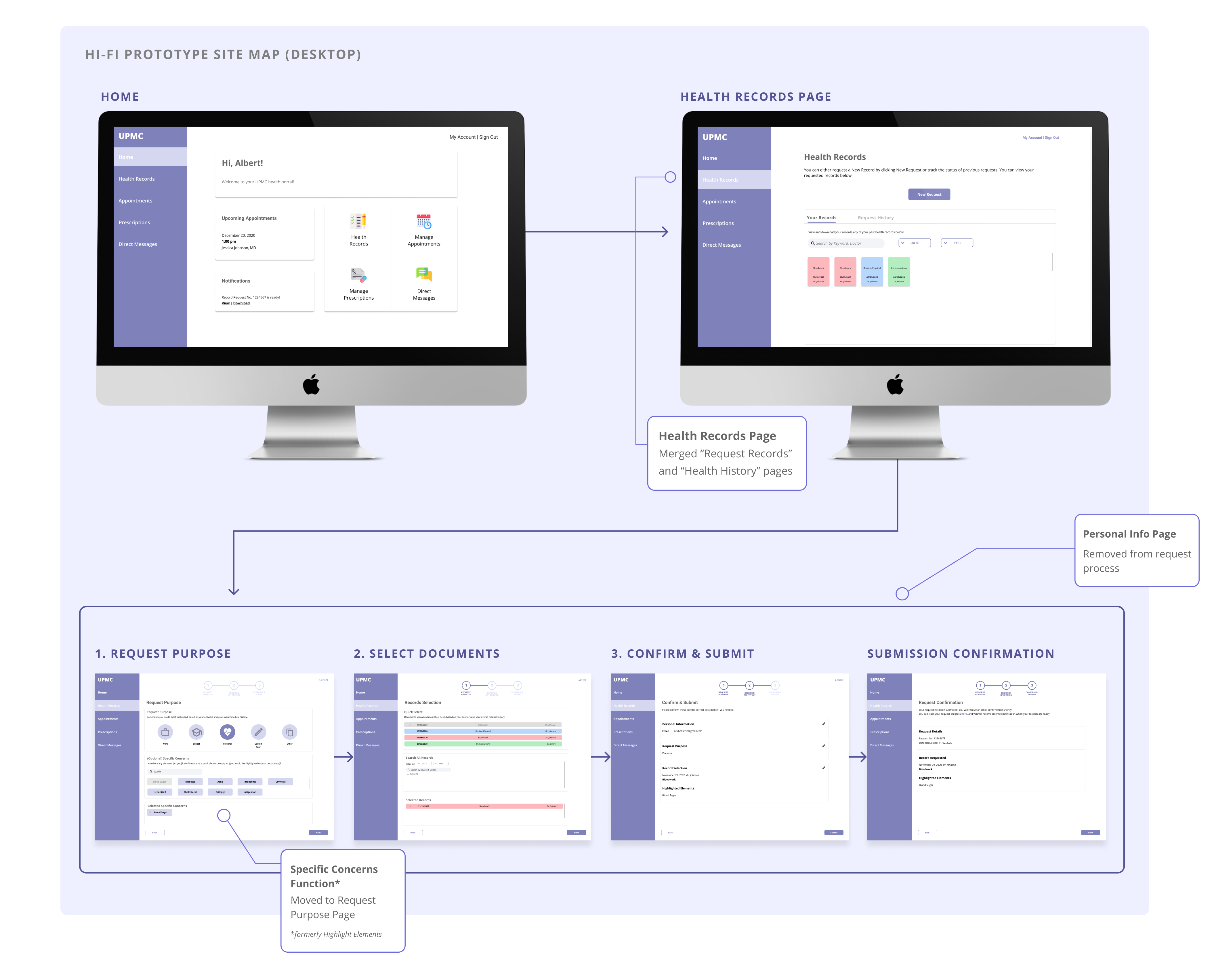
For our high fidelity prototype, we focused on both addressing the issues in our previous iteration and adding additional key features that were missing.
- Moved the “Highlight Elements” function to the “Request Purpose” page
- Removed the redundant “Personal Info” page to streamline the process
- Merged and restructured the “Request Records” and “Health History” pages to become the “Health Records” page
- Cleared up ambiguity regarding the search function and where requested recors would be stored
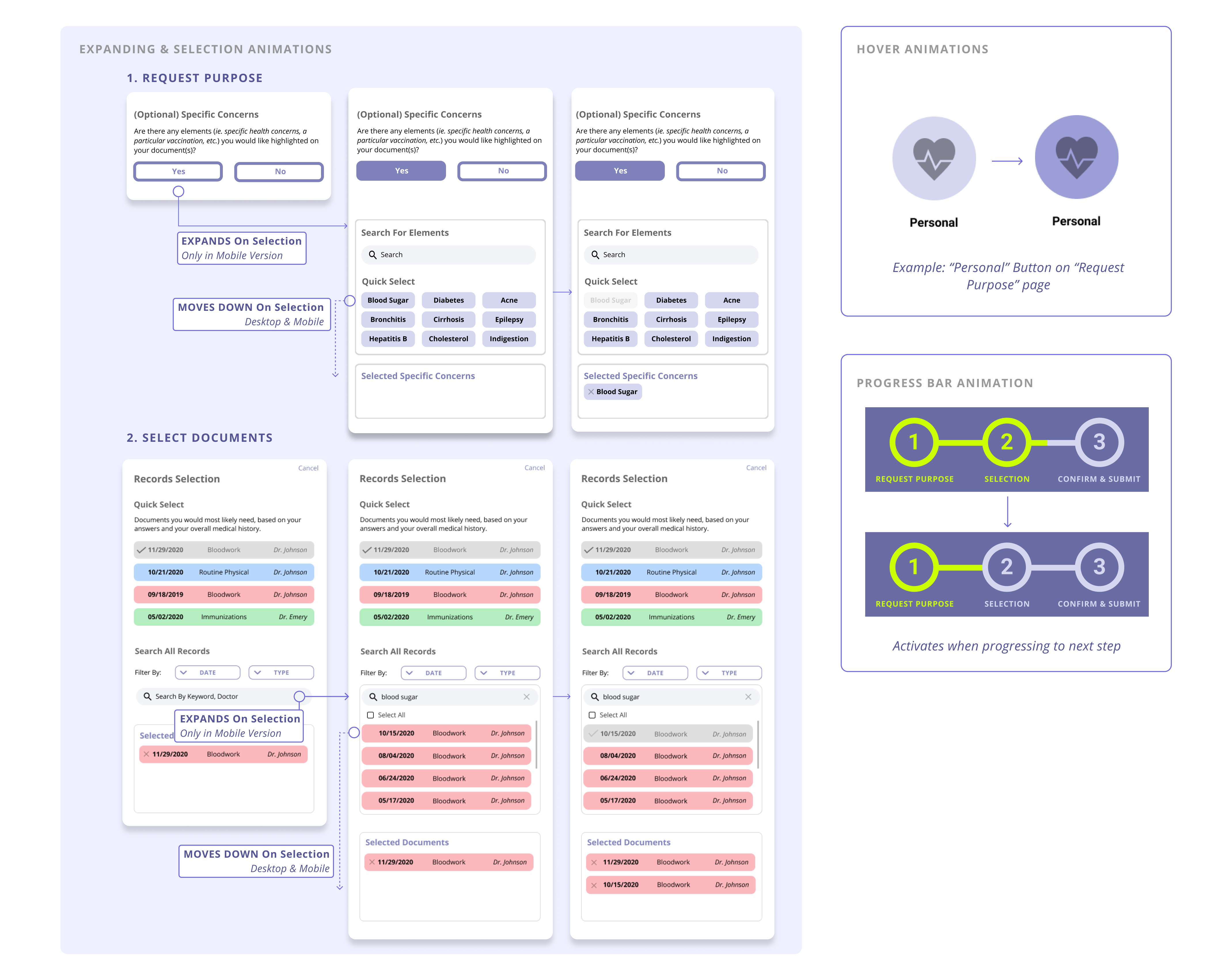
Micro Interactions
Our main goals in implementing micro interactions were to add dynamism, provide more perceptual affordances to users, and enhance our design for mobile screens.
- Hover animations to indicate and provide visual feedback on selectable items
- Selection animation, where the selected element would physically move down into its respective selection box
- Expandable elements upon selection
Reflection
This project taught our group how to keep moving forward in the design process. Especially during the early stages of research, we were caught up in the little details and wanting to make sure we had all the information before proceeding to the next step in the design process. Even after our pop-up research, we wanted to do a second round of research to explore different avenues we had not yet looked into. It was hard for us to get past this and just pick a direction to go in. Understanding this idea of ‘keep moving forward’ was really important because it helped us not get stuck. There’s never really going to be one decision to leads to the perfect solution. Using our research, we just had to keep making decisions and eventually we came to an effective solution.