X-RAY
Enabling discovery in style.
Team Members
Cam Davison
Shalini Rao
Amanda Piccolini
My Role
Visual Designer
Global Engagement and Trends
Creating Animations
Tools and Skills
Affinity Mapping
Motion Graphics
Prototyping
Figma
ProtoPie
Project Description
Our first group assignment of IxDS1 was to create a display tailored for two users and a stakeholder to help the adidas team. We had to analyze our personas to understand the key needs of the users/stakeholder. This is a display that distills the stream of data into actionable data insights to spark ideas, collaboration and ultimately drive the team to innovate Adidas fashion sneakers with data.
Duration
5 weeks
Persona Analysis
In our first meeting, we looked into the data and created an affinity diagram, grouped commonalities and began recognizing patterns in customer reviews, competitive data and sales. We found Ansela, Kenny, and Sos look are interested in a global lens, fashion trends, and social responsibility.
We then turned to the user personas in an effort to understand their goals and motivations.
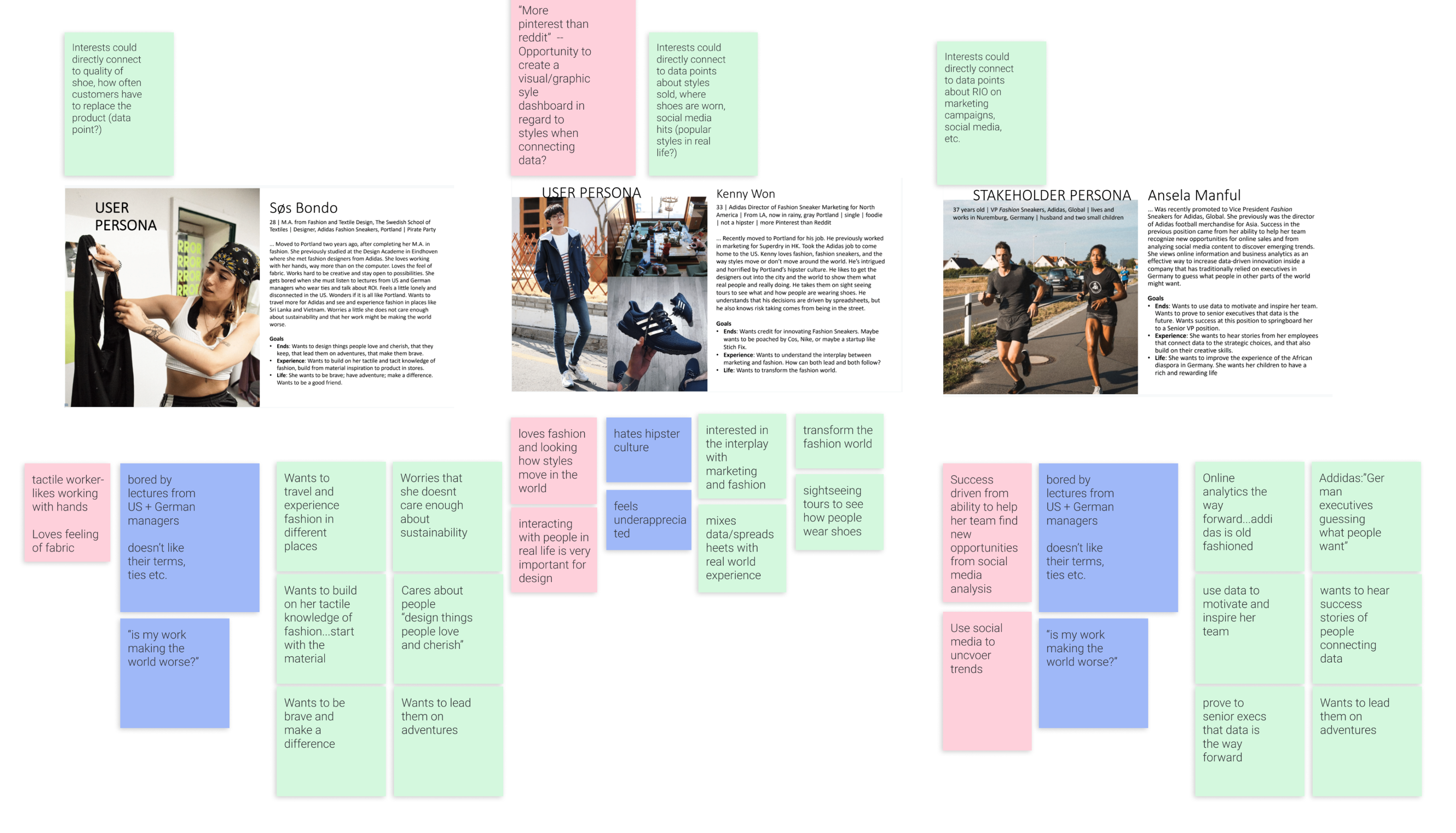
1 Sos
Sos wanted to build on her materiality knowledge to improve products
and inspire users
2 Kenny
Kenny wanted to understand the
intersection of marketing and fashion
3 Ansela
Ansela
wanted to leverage social media and business analytics
to empower data-driven innovation
Current and Future State sketch
We identified a key driver for each user from our diagram to use in a current and future state diagram. The next step of our project definition was creating a current/future state diagram.
We chose a defining problem for each user and imagined what their ideal future solution would look like. We then ‘filled in the middle’ by determining what data or tools we would need to bridge our user to that ideal future.
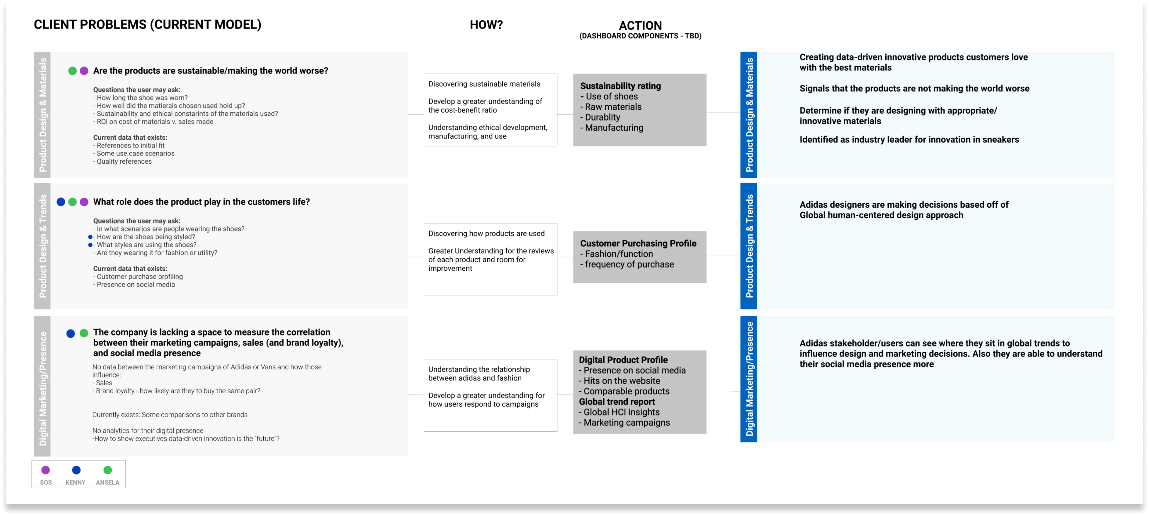
1 Sos
Are our products created responsibly and sustainably?
2 Kenny
What role does the product play in customers’ lives?
3 Ansela
The company is lacking a space to measure the correlation
between their marketing campaigns and sales (and brand loyalty).
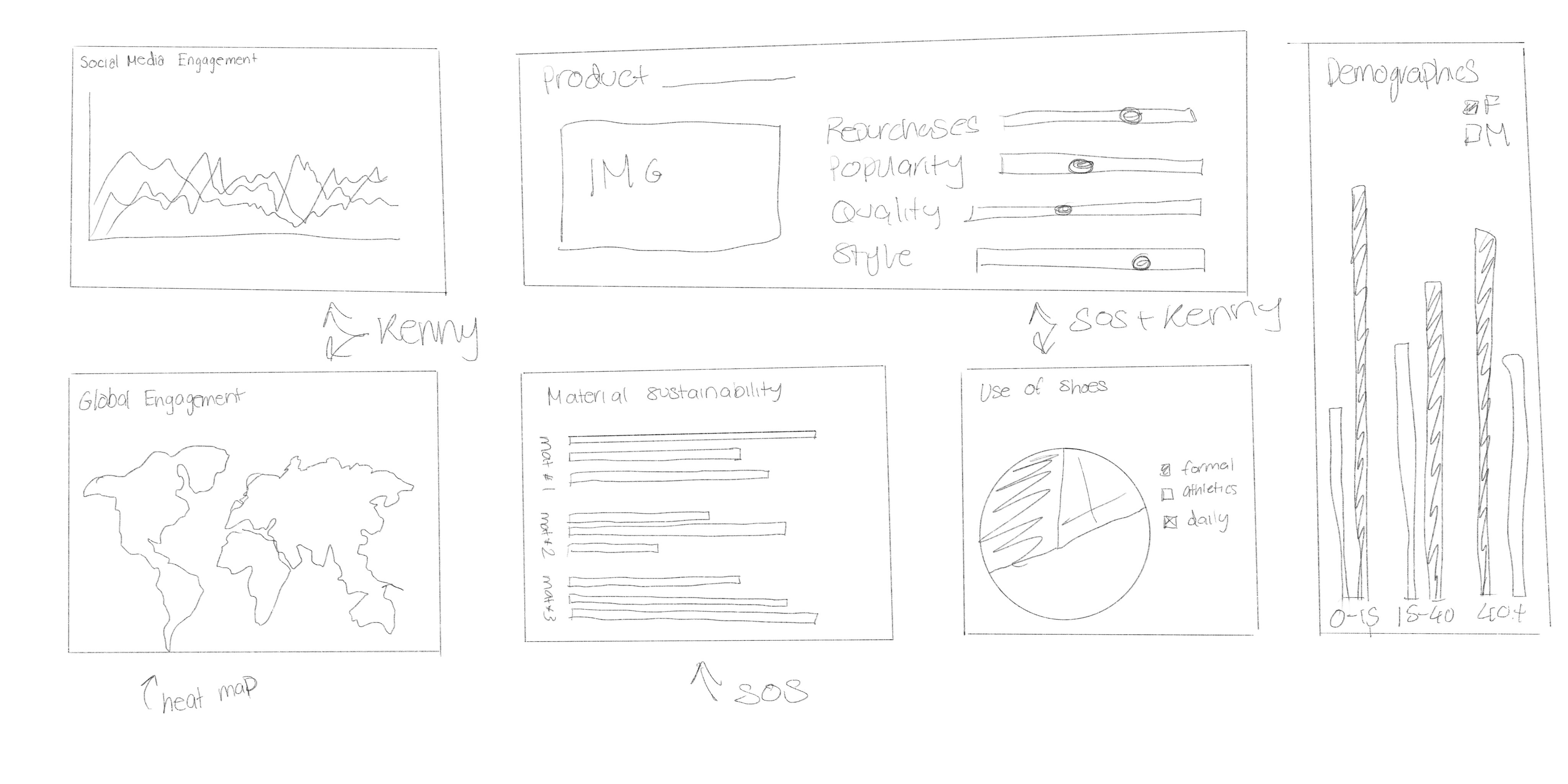
Sketches
As we transitioned from problem definition to solution ideation, each team member individually sketched possible solutions. This resulted in a wide range of ideas that would ultimately inspire future iterations. With a variety of ideas, our next step was to identify the key ideas and refine the focus of our first iteration.
Upon reflection, we agreed it would have been beneficial to spend more time on ideation, but due to time constraints, we were forced to focus on a limited 2-3 sketches. That being said, the ideas we did focus on, combined with the direction from the critique, provided us with a solid foundation of purpose to move forward with to iteration 1.
Low-fidelity
Armed with a refinement of our key ideas and feedback from our sketch critique, we moved toward creating the first iteration of what would become our dashboard. Before we set out in the design process we decided on a constraint to guide our thinking: the primary goal of our dashboard.
Primary Goal: Leverage social media data and business
analytics to empower data-driven innovation and inspire Kenny and Sos
With this goal, we also gave ourselves the constraint that Kenny and Sos would be the primary users of this dashboard and Ansela would be the managing Client on the project. With this purpose as our guide,
We set off to design our first iteration based on the following:
1 Multiple Views
A specific view satisfying the key driver(s) for users
2 Overall Score
Exploring the idea of product and material rating
3 Idea Flow
Exploring the idea of a team ideation view
Low-fidelity Reflection
It was a boost to the team’s morale to see the dashboard taking shape and seeing how we could improve it. During the crit, it was both refreshing and scary to see that we had taken a different approach from most groups. Based on the feedback we receive we needed to improve what the overall score is defined as on each page, what specific data will go in each view, and the visual design.
We based our second iteration on the following:
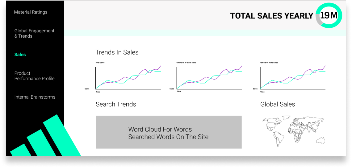
1 Sales
Removed the sales slide as it wasn’t tied directly to our primary user needs
2 Dark Mode
In an effort to increase visbility, reduce strain and create a cohesive look + feel, we changed our visual design to a dark mode
3 Scores
Remove the scores from all views except material
4 Data Visualization
Refined visual expressions of data
Mid-fidelity Iteration 1
At this stage, we refined and established a purpose, action and primary user(s) for each view:
Product Performance
Primary User: Kenny + Ansela
Purpose: Provide quantitative proof that data driven innovation is paying off + identify areas for improvement
Action: Make strategic decisions for the team based on data
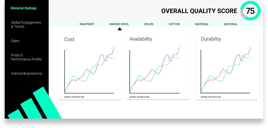
Material Ratings
Primary User: Sos
Purpose: Help Sos provide business rationale (viability and feasability of materials) to her material driven design ideas
Action: Leverage this understanding to inform material design decisions and/or strengthen her pitches
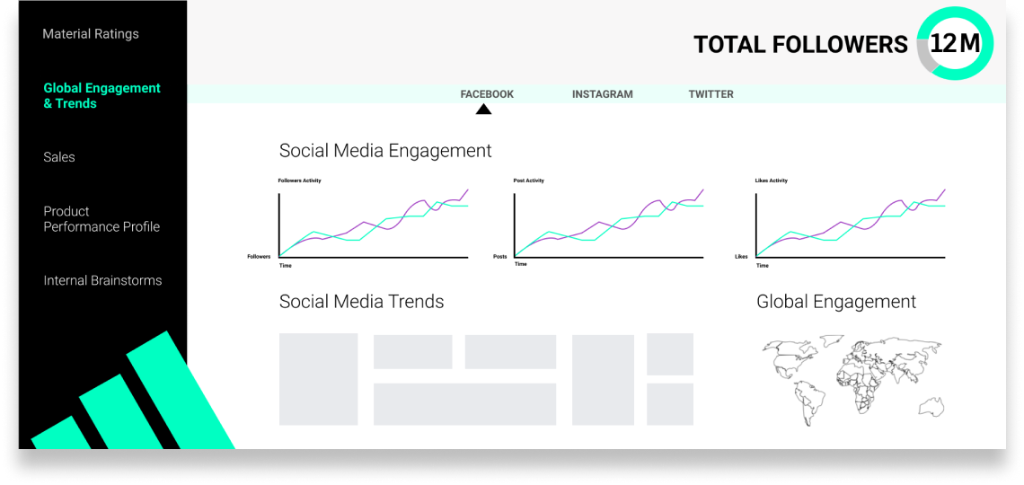
Global Engagement
Primary User: Kenny
Purpose: Help Kenny identify the intersection of how customers are using Adidas shoes and high fashion trends
Action: Inform new marketing decisons to facilitate innovating the fashion sneaker market
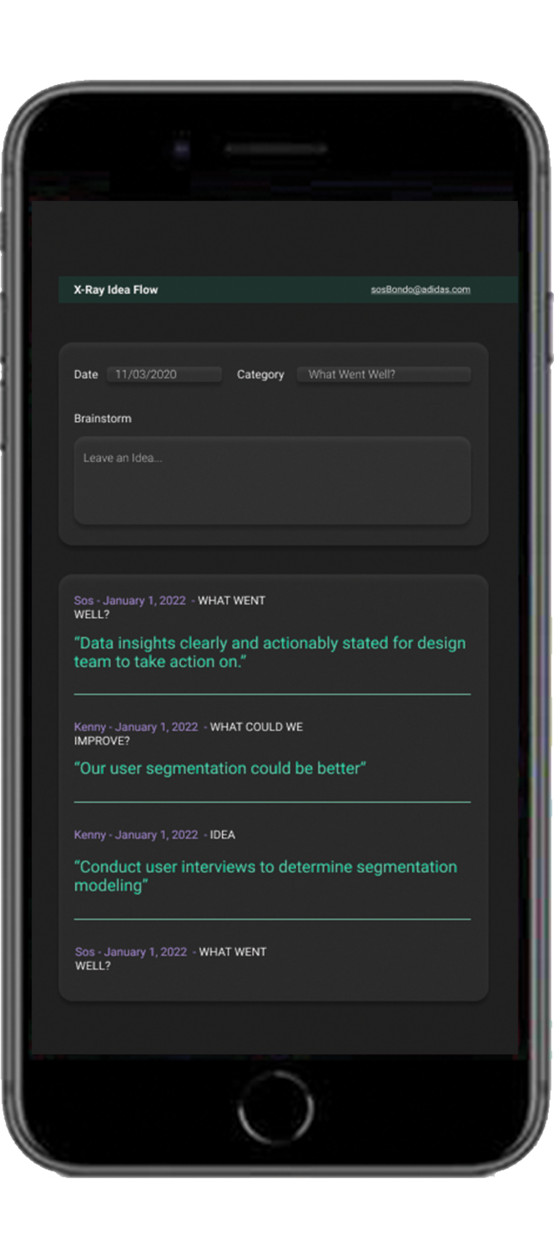
Idea Flow
Primary User: Ansela + Team
Purpose: Team inspiration diagnostic for Ansela, validate team’s hard work and risk taking - build self-efficacy
Action: Take action based on team inspiration and morale (Ansela) + take creative confidence away and apply it to their respective roles (team)
Mid-Fidelity Iteration 1 Reflection
A class critique revealed the following considerations:
- Which aspects were global vs regional?
- How would Kenny be able to compare global trends to adidas trends?
- What is the primary purpose of the idea flow page?
- Who would use the brainstorm section and how would information appear there?
We had to further think about not only what information made sense to include on our idea flow page, but also how to present this data with intention as to not be distracting to the user.
Mid-Fidelity Iteration 2
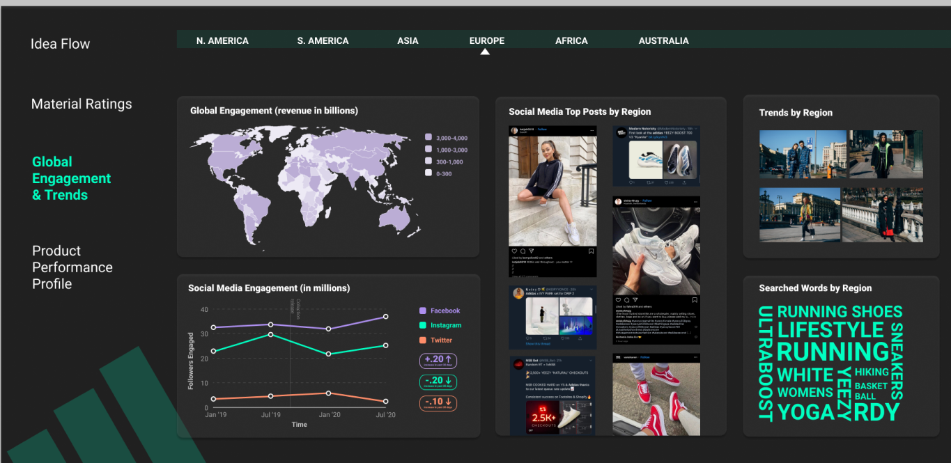
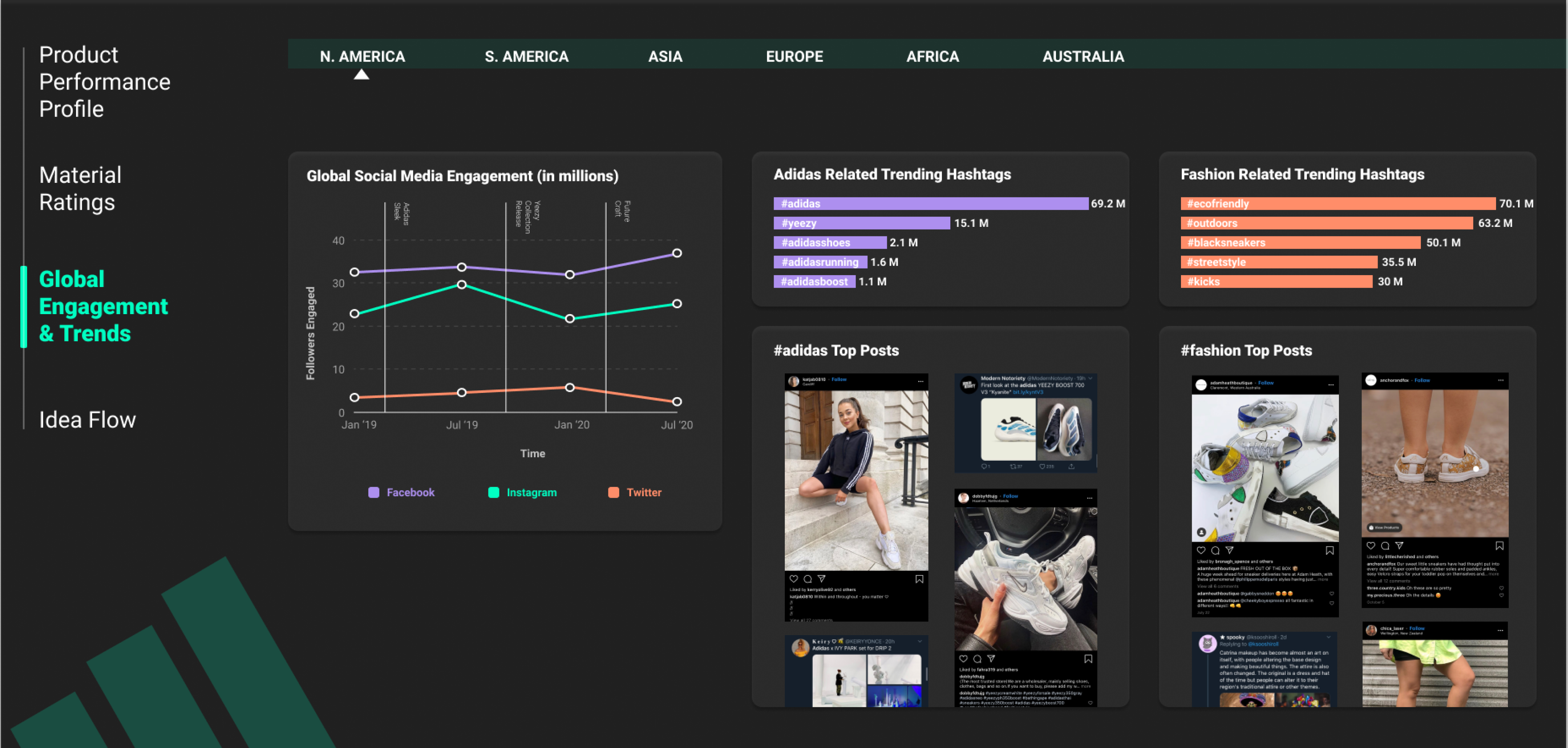
Global Engagement and Trends
In this iteration we cleared up that the map was changing based on region by zooming into the region specified. We also used a similar language for global trends and Adidas trends, so it would be easy for Kenny to quickly guage the key differences and similarities between them.

Idea Flow
In this iteration we experimented with adding campaign information to idea flow to provide motivation and spark feedback and ideas. While the ‘Our Work’ section was a departure from our original idea to inspire, we thought the increase in visuals and information would help with the motivating purpose.
Mid-Fidelity Iteration 2 Reflection
During this iteration we did not focus on changing the Material Rating and Product Performance Profile views as much, but still did receive beneficial feedback during crit for the next round of iterations
A class critique revealed the following considerations:
- How can we make idea flow engagement more clear?
- What is the context of the dashboard?
- How can we compare different materials?
- Establish Information Hierarchy
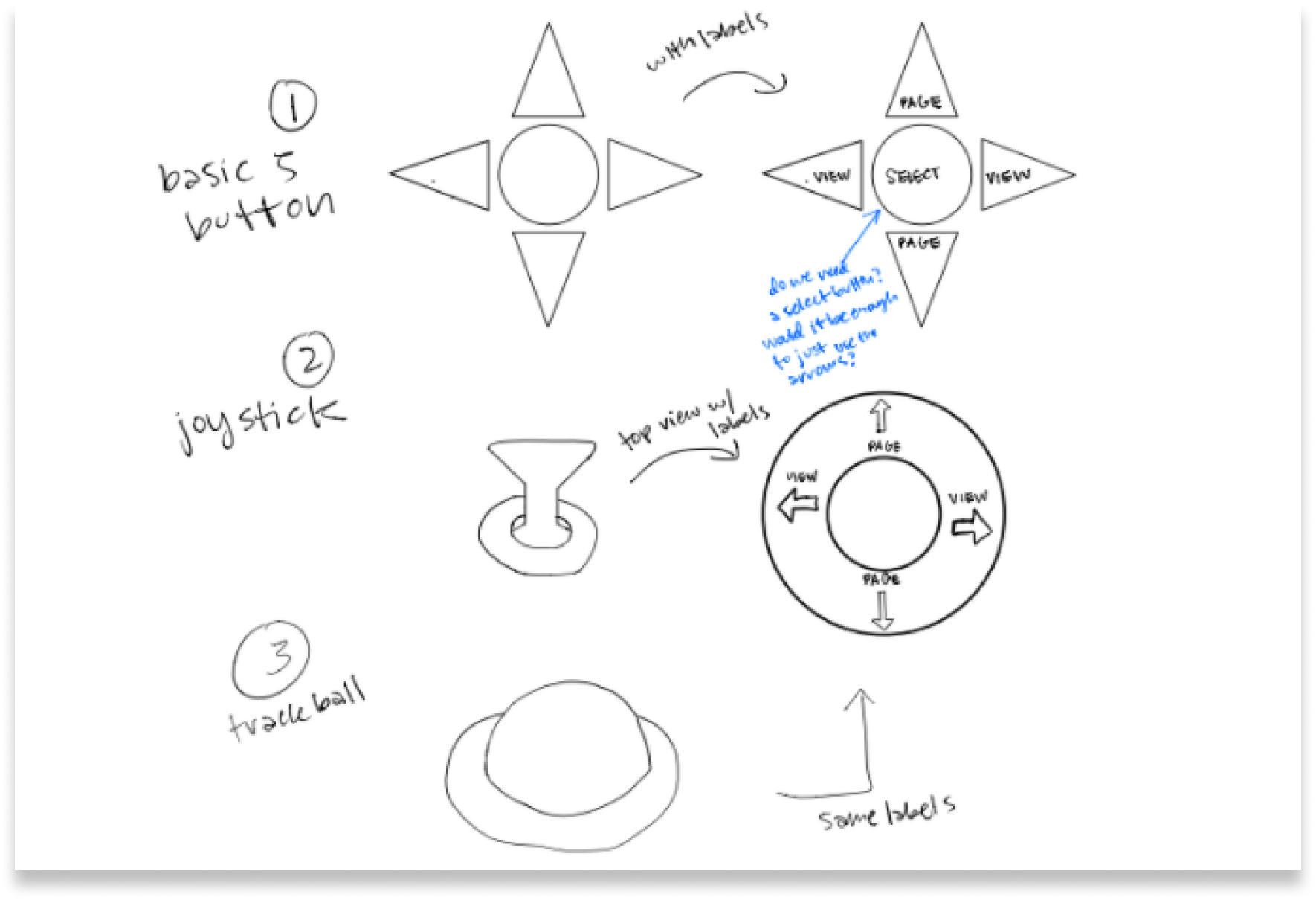
Control
We had gone into the design process with a basic 5-button control intended to allow the user to switch through views and subviews. However, we still wanted to evaluate other controls that had horizontal and vertical movement for the views and subviews.
The main issue we found with the joy stick and trackball was the lack of precision that would come from a 360 degree allowance. So, we landed back at our original 5-button control design.
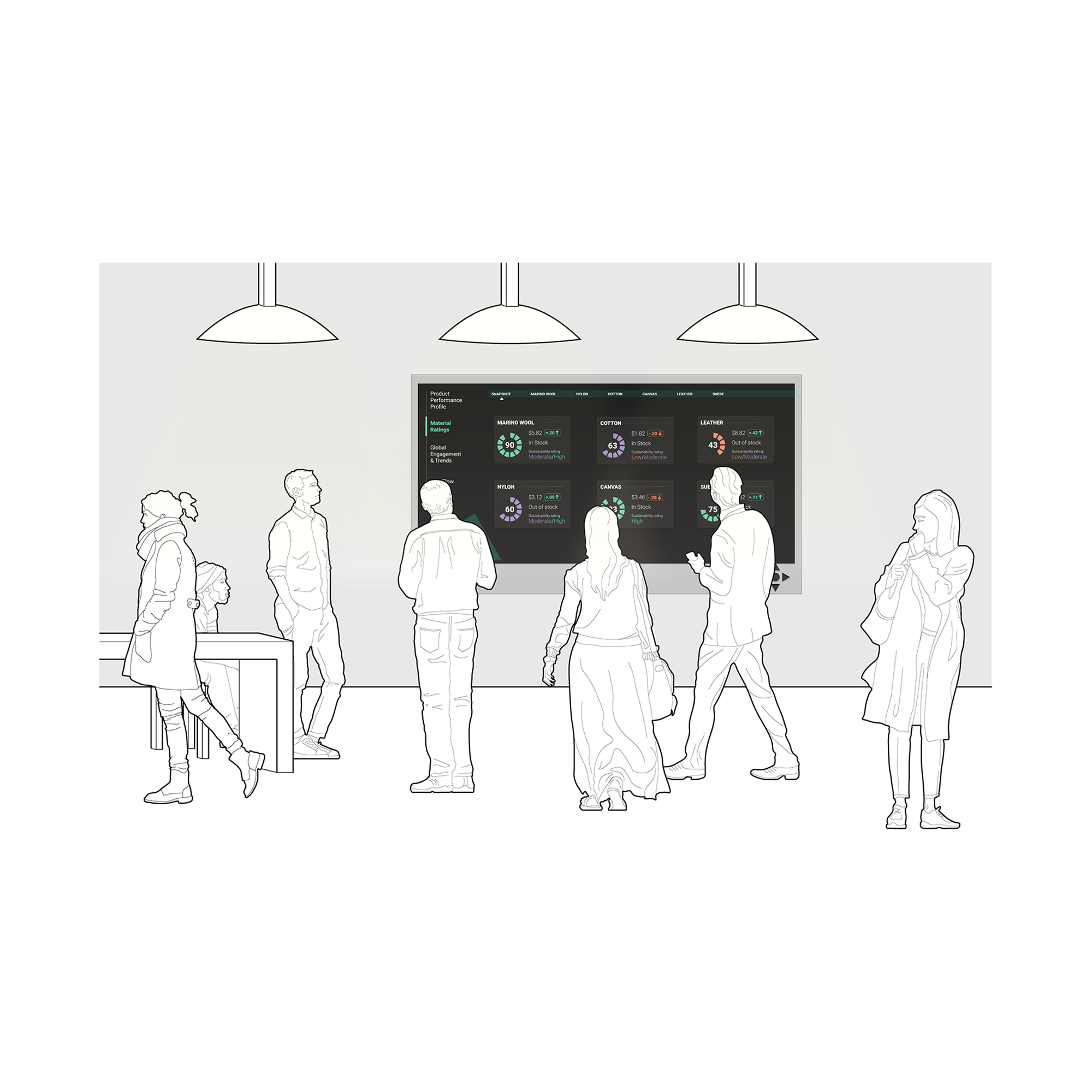
Motion
We imagine our dashboard is located in a high traffic area of the office where both teams would gather. The dashboard distills the stream of data into actionable data insights to spark ideas, collaboration and ultimately drive the team to innovate Adidas fashion sneakers with data.
Our dashboard automatically cycles between views, to feature multiple data sets and draw the users attention. When the user chooses, they can use the control to interrupt the cycle. Additionally, we have motion to provide real time updates for top posts, so Kenny and Sos can see how users are currently using their products.
Iteration 3
This was our final iteration of the dashboard. Through this dashboard our personas are able to use the data to drive and inspire their innovation to create fashionable sneakers. Ansela is able to prove to her that data driven innovation will change Adidas.
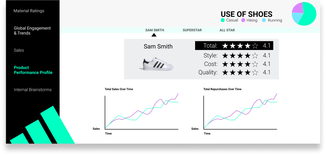
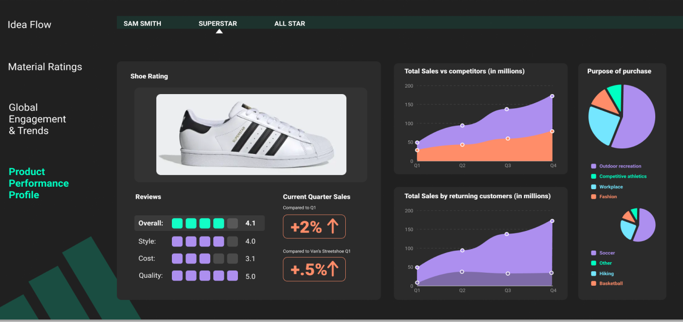
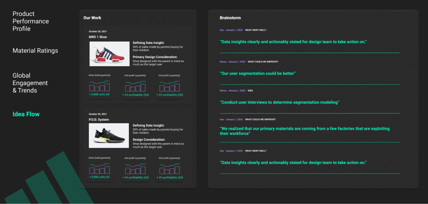
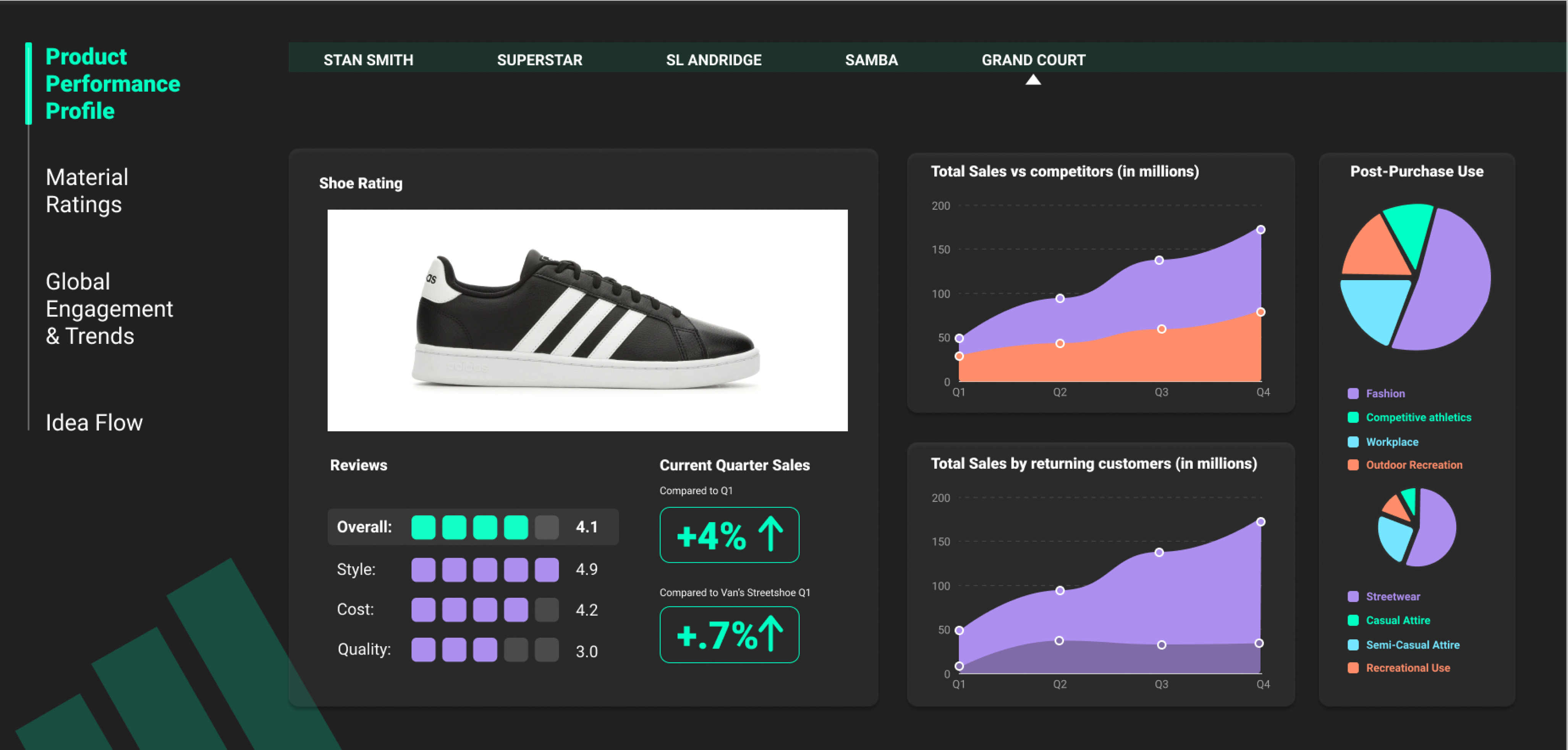
Product Performance
We adjusted the pie chart so that there is more of an emphasis on how the sneakers are being used as fashion sneakers becuse Kenny and Sos are interesting in increasing fashion knowledge and would like to know how their customers are using their fashion sneakers.
Material Ratings
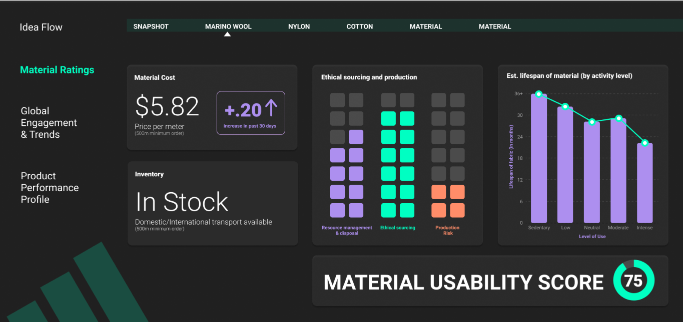
We added a Snapshot page to help Sos easily compare materials without having to switch between views. This present the most important information from each view, so she is able to quickly glance at all the materials and get an overall idea.
Global Engagement
We removed the map becuase we felt as if we were adding it more for aesthetic and because it was a common theme amongst groups rather than for the users. We moved Adidas trends and global trends next to each other so that there is not data disrupting the flow between them.
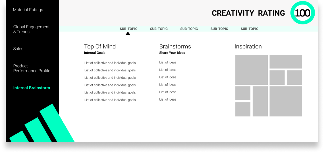
Idea Flow
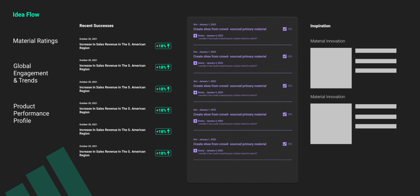
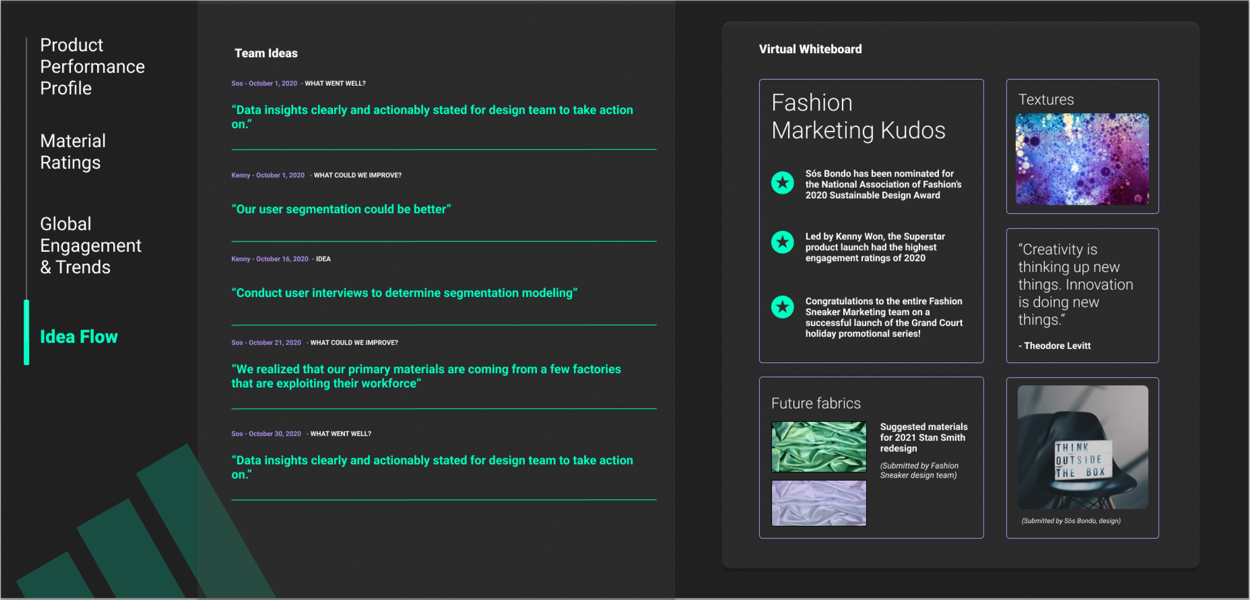
We ultimately decided to dedicate the idea flow to being a tool for inspiration and motivation. It included a scrolling list of team ideation on the left and a digital white board on the right where the team can share kudos, moodboards and visual expressions of ideas to inspire the team.
Quantitative snapshot of what’s working/what’s not
Primary User: Kenny + Sos
Primary Action: They can look at the performance of each individual shoe they design to see if their design methods are having an impact on how customers use and rate the shoe.
This view gives a spotlight to each shoe Adidas and the design team releases. Each shoe’s process is different; the team can look at how their design process affects the performance of the shoe so they can prove to themselves and to exec that the methods are viable and should be adopted for future releases.
Facilitate material driven design innovation
Primary User: Sos
Primary Action: At a glance, Sos and the design team can compare a number of materials side by side.
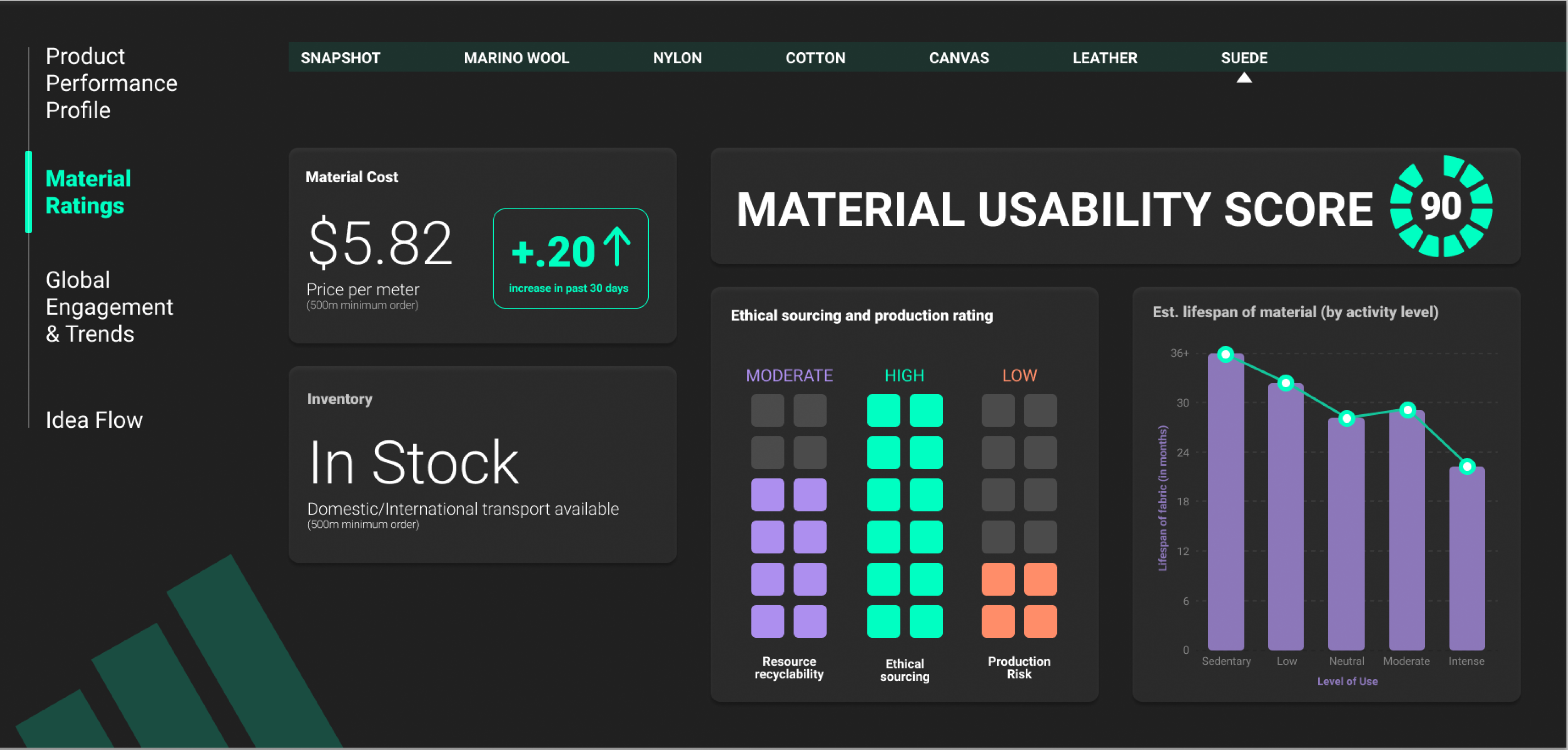
This view shows a snapshot of data as it realtes to material aquisition, sourcing, an sustainability. While this data is provided in the individual sub-views of material ratings, the snapshot allows users to directly compare the pros/cons of using one material in place (or in addition to) another.
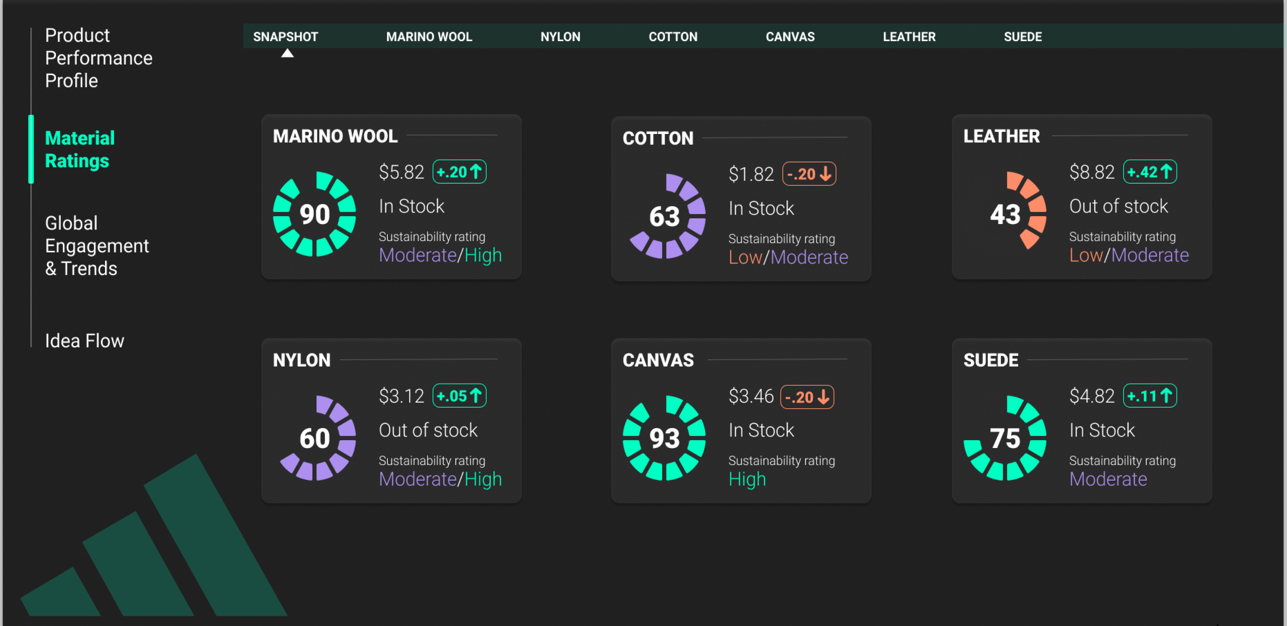
At a glance, Sos and the design team can determine the feasibility of obtaining the highlighted material, while keeping a heightened awareness of the ethicality and sustainability factors related to its consumption.
This view shows a snapshot of data as it realtes to material aquisition, sourcing, an sustainability. All of this data is reflected in the singular Material Usability Score that is designed to caputure attention and provoke action.
Illustrate Intersection of Adidas Engagement + Fashion trends
Primary User: Kenny
Primary Action: This view is meant to help him see intersections and divergences between how real customers are exeperiencing the brand and global fashion trends.
Secondary User: Sos
Secondary Action: Sos can see how her customers are using her products and can see the impact she is making through social media.
Team Inspiration + Motivation
Primary User: Ansela + Kenny + Sos
Primary Action: Ansela can gauge team motivation, and Kenny and Sos can voice ideas, validate their work and bukd self-efficacy.
On the left side of the view we have the idea flow which is a scrolling flow of team generated ideas on what’s going well, what can be done better and general ideas. On the right side we have a virtual white board where the team can share kudos, moodboards and visual expressions of ideas to inspire the team.
Reflection
Based on our feed back we would want to further explore how the dashboard could be used in different scenarios and how we could compare information between views. Our next step to address the feedback would be to create an app. This would allow Kenny and Sos to input their ideas for the idea flow, as well as pull up the dashboard from a phone or tablet.